Website Strategy and Design for Finished Art, Inc.

Objective
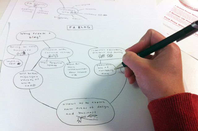
Finished Art was considering creating a blog, but the company was not sure whether it was worth the effort or how the blog would actually work. During some free time, I decided to sit down and think about whether a blog could be a good idea for the company and what benefits and challenges it could bring.
I presented the strategy for a website redesign to the President of Finished Art, Inc., then I began spearheading the website redesign and the creation of the new blog.
Process
I first thought about three basic things:
- why create a blog?
- what content could be included?
- who could contribute & how?
The different backgrounds, interests and talents of each member of the Finished Art team is what sets this company apart from other small agencies. It is one thing the company’s president, Donna Johnston, is very proud of and frequently talks about. I quickly realized that FA’s current site did not adequately highlight this array of talent – in fact, there was not a page listing capabilities or even descriptions associated with portfolio images.
I wanted to find a better way to share this diversity and passion with FA’s clients and potential new business partners, as well as give each team member the opportunity to grow and explore his/her interests. The addition of a blog was the perfect way to accomplish this.
However, instead of just creating a blog as a separate entity, I knew it would be better to redesign FA’s entire site to improve user experience, maximize client interaction and promote the Finished Art brand. It would also improve Search Engine Optimization.
I looked at websites and blogs from other design agencies I admire in order to pinpoint what elements from those sites would be beneficial for FA. After a couple months of management meetings, content creation, and coding, the website is now up and running at finishedart.com.
Design

Before

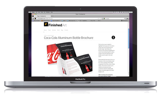
After (Portfolio Page)
Users can now leave comments about work, share FA’s projects, or like posts on facebook directly from the site.

After (Team Page)
Other areas of the site include:
- a team page with bios and caricatures that were made of each employee over the past few years
- an about page including a brief overview of what FA does, company history, and an archive of images of the holiday cards the company sends out every year
- a services page with direct links to portfolio items corresponding with the service categories
- the blog page
- a contact page, now with a google map and simple contact form
Outcomes
My hope was to give each employee the chance to be creative in their downtime and be involved in shaping the direction of new business. Ideally, the posts they publish could intrigue a potential client, then they could get the chance to work on a project related to their interests.
So far, artists are already being featured on the new blog and there is a sense of excitement in the office. One coworker even stretched out a canvas to paint for the first time in years because he felt inspired.
I can’t wait to see more artwork featured on the site, and I look forward to getting feedback from some of FA’s clients.

Related posts:
Comments
One Response to “Website Strategy and Design for Finished Art, Inc.”
Trackbacks
Check out what others are saying...[…] Check out the design of Finished Art’s new website here! Share this:SharePrintEmailFacebook « Newer Entry Older Entry […]