Environmental Infographics in Honor of Earth Day
In honor of Earth Day this past weekend, here are a few environmental infographics courtesy of GOOD.
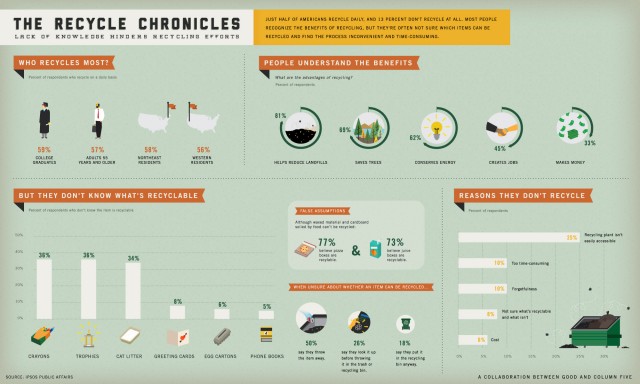
Infographic: Why Don’t Americans Recycle?.
Just half of Americans recycle daily, and 13 percent don’t recycle at all. Most people recognize the benefits of recycling, but they’re often not sure which items can be recycled and find the process inconvenient and time-consuming (a topic of personal interest to me).
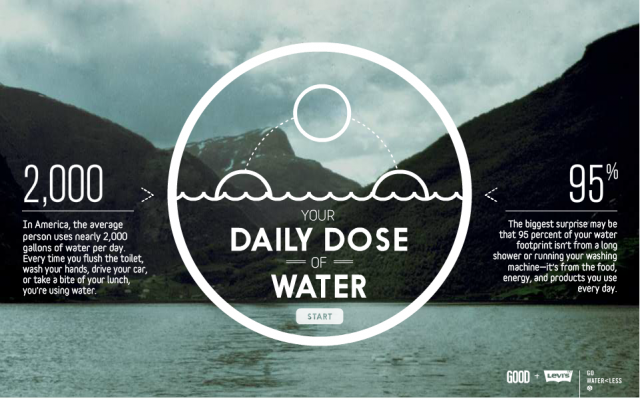
Interactive Infographic: Your Daily Dose of Water
In America, the average person uses nearly 2,000 gallons of water per day. Every time you flush the toilet, wash your hands, drive your car, or take a bite of your lunch, you’re using water. The biggest surprise may be that 95 percent of your water footprint isn’t from a long shower or running your washing machine—it’s from the food, energy and products you use every day. Check out our interactive infographic that shows all the ways your daily dose of water adds up on a typical day.
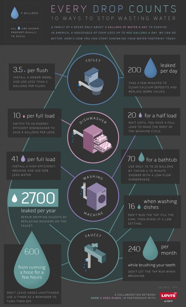
Infographic: 10 Ways to Stop Wasting Water
When it comes to getting clean water at home, most of us turn on the tap and don’t give it a second thought. But for nearly one billion people, finding clean water is a daily struggle. Lack of access in their homes or their community can cause a multitude of health, economic, and quality of life problems. For those of us fortunate enough to have clean water access, it’s more important than ever to help conserve this important resource. It’s estimated that a family of four can survive on 3 gallons of water a day but in America, a household of four uses up to 400 gallons of water a day. Check out this infographic to learn about the top culprits for water waste and how fixes both small and large can significantly shrink your water footprint at home.
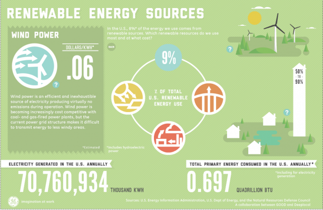
Interactive Infographic: Which Renewable Energies Do We Use Most and At What Cost?
In the U.S., only about 8 percent of all energy use comes from renewable sources. Petroleum is currently our largest consumed source of energy (37 percent), with natural gas (25 percent), coal (21 percent), nuclear power (9 percent) and renewables following behind. However, renewable energy consumption is rising steadily, with the largest increases in biofuels, hydroelectric power, and wind. Currently, the cost of generating electricity with coal and natural gas is still cheaper by kWh, but new technology and interest in renewable resources is helping alternative energies become more cost-competitive. Check out this infographic for a look at which of these renewable sources are used most widely in America and at what cost.
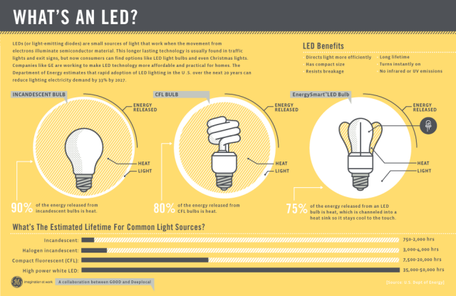
Infographic: What’s an LED?
When it comes to bright ideas, LED lights (or light-emitting diodes) are incredibly energy efficient and long lasting. Unlike traditional incandescent or even CFL bulbs, they illuminate when the movement of electrons across semiconductor creates light. Historically, they’ve been too expensive to be practical for most residential use, but companies are working to make it more affordable for consumers to have at home. Learn more about potential advantages of LED lights and how they work.
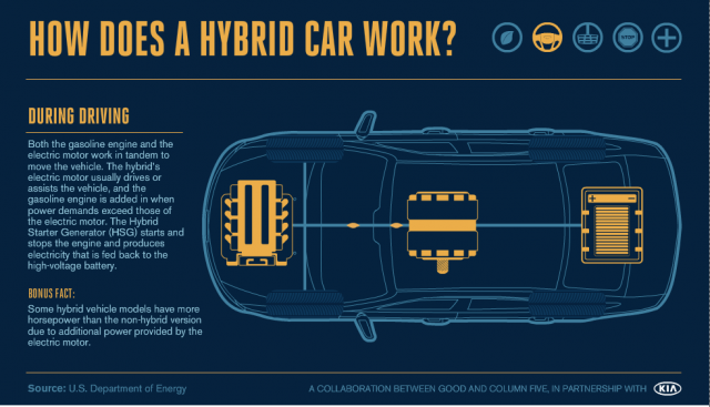
Interactive Infographic: How Does a Hybrid Car Work?
These days, people are more concerned than ever about consuming less gas. Fuel prices are sky high, plus there’s also more urgency than ever to decrease dependence on oil. It’s no wonder that hybrid cars are increasing in popularity as more manufacturers are offering hybrid models of some of their most well-known cars. You’ve probably seen lots of hybrid cars on the road, and maybe you even own one. But have you ever wondered how they work? Hybrid cars utilize both stored electricity and gasoline, resulting in a ride that is more fuel efficient. Click on the interactive infographic link to learn more about this breakthrough technology that’s becoming more commonplace on America’s roads.

Related posts: